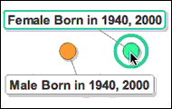
Explore the relationship between age and gender through generations using the animation chart below. Each bubble represents a group of men or women who were born during decennial census years (cohorts) in 20th century America.
Use the check boxes on the right side of the chart to select specific cohorts and to add or remove trails. By pressing the play button or using the slider below the chart, see how the proportion of men and women in a given cohort changes over time.
One story that emerges from the data is that between age 40 and 50 women start to overtake men and become the majority of the population in their cohort.
To track actual population numbers instead of percentages, change the X (horizontal) axis to "Number of People" and choose multiple cohorts using the "Select" tool on the right. Hit "Play" and follow the differences from one generation to the next, including the impact of the Baby Boom starting with the 1950 cohort.
Investigate other variations by generation and consider potential causes, such as immigration or war. Share your own observations in the 'Comments' section below.
Data Source:
- U.S. Census, via the Integrated Public Use Microdata Series, Minnesota Population Center