|
Environment
Latest CO2 Emissions Data by Nation, Per Capita
Carbon dioxide emissions are rising worldwide with just 20 countries responsible for more than 75 percent of them, according to new data from the Carbon Dioxide Information Analysis Center. How do the world's nations measure up? What's a nation's output come to per person? And just how big is a metric ton of CO2? Use an interactive dashboard to analyze CO2 emissions data.
|
 Twitter
 |
![]() How much does the federal government spend, how is that money raised, where does it go and how has spending changed over time? A State of the USA tutorial.
How much does the federal government spend, how is that money raised, where does it go and how has spending changed over time? A State of the USA tutorial.
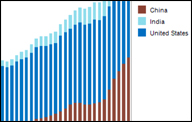
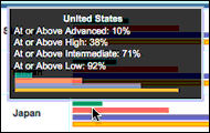 Should your middle schooler be brushing up on science during the summer break? Explore how U.S. fourth- and eighth-graders compare to their international peers with our interactive graphical scorecard.
Related: International Math Achievement
 Explore international health costs and outcomes for developed countries, comparing data in an animated chart.
 Navigate maps, satellite imagery and Google Earth to explore the profiles of countries identified by the independent Nuclear Threat Initiative as having any attempted, former or established programs capable of producing weapons of mass destruction.
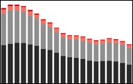 Violent crime has fallen for the third straight year, according to new data from the FBI. Murder and robbery saw sharp declines, while rape fell by just 2.4 percent when compared to 2008 estimates. Use a stack graph to see violent crime trends over time.
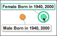 How have percentages of men vs. women in a given generation changed over time? And what unique factors might be in play from one 20th century generation to the next?
 A new study on the reading habits of kids finds digital or electronic devices may have a negative effect on reading time, family time and physical activity -- and 39 percent of children ages 9 to 17 years old think that the information that they find online is always correct. Use an interactive graph to see how advances in digital technology are changing a generation of young Americans.
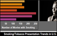 Recent research finds exposure to on-screen smoking in feature films increases the likelihood that young people will start smoking tobacco. An interactive chart looks at the percentage of movies with on-screen smoking, from 1999 to 2008.
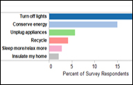 Americans are taking steps to conserve energy, just not the most effective ones, according to a new report by Columbia University's Earth Institute.
 A new Census Bureau report says a sharp rise in the number of opposite-sex unmarried couples living together may be less about romance and pending marriage and more about jobs.
Carbon dioxide emissions are rising worldwide with just 20 countries responsible for more than 75 percent of them, according to new data from the Carbon Dioxide Information Analysis Center. How do the world's nations measure up? What's a nation's output come to per person? And just how big is a metric ton of CO2? Use an interactive dashboard to analyze CO2 emissions data.
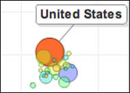
 Are median income measures better than GDP for gauging a nation's economic health? Draw your own conclusions with this visualization charting historical GDP and median income data.